SD

CASE STUDY

QuickAid

Mobile App
View Prototype

About QuickAid

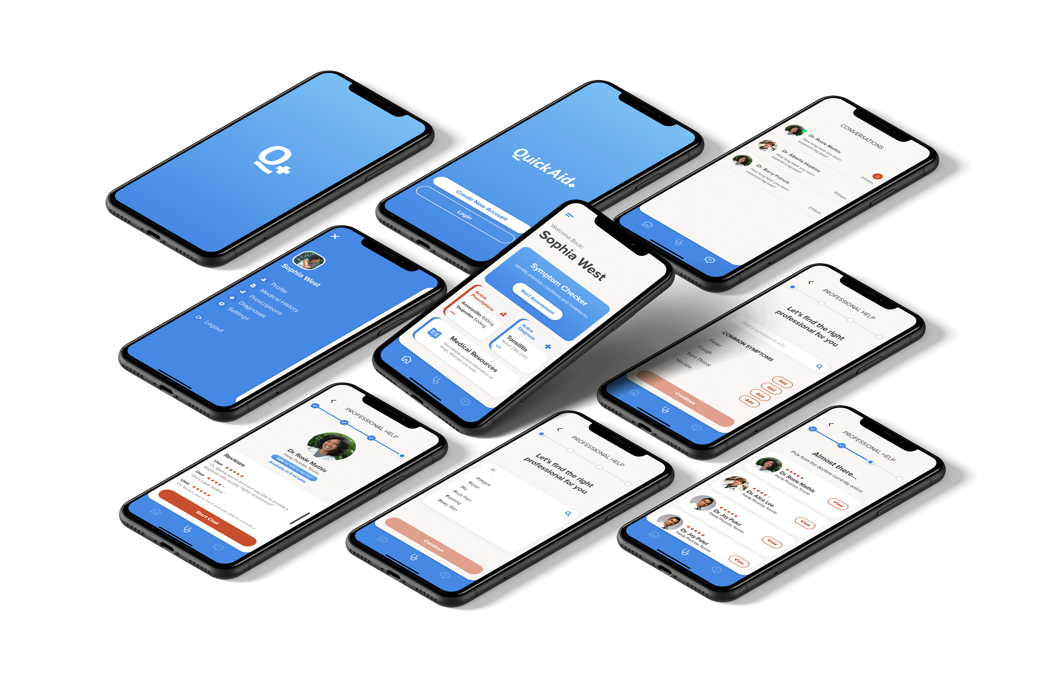
QuickAid is a virtual healthcare app that makes it easier than ever for users to connect with Canadian doctors for online medical care right from their smartphones. It also provides an online symptom checker, giving users a report to help people actively manage their health assess their needs.

Timeframe

3 weeks

Tools

Sketch, InVision, Adobe Illustrator, Adobe Photoshop, Principle

Role

User Researcher, UX Designer, UI Designer

THE PROBLEM

Canadians are skipping on seeing a doctor for reasons ranging from long wait times to availability of doctors. 

68% of Canadians have skipped out on visiting a doctor due to various barriers (Ipsos Survey, 2017). This means that in case of non-emergencies, majority of people don’t seek or receive professional medical advice. 1 in 3 Canadians resort to self-medicating with OTC remedies when they experience any symptoms and several individuals look up symptoms online instead of making an appointment with their family doctor or visiting a walk-in clinic.
The top reasons for this are long wait times, unavailability of doctors outside working hours, inability to get a timely appointment and wanting to avoid germs in the waiting room. While the reasons might vary, Canadians should have easier access to professional medical advise for non-emergencies whenever they need it.
PROJECT GOAL
The ultimate goal of this project is to help Canadians receive prompt and reliable medical advice for non-emergencies and provide them with the knowledge they need to make better decisions regarding their health. 
SECONDARY RESEARCH
68% of Canadians have skipped out on visiting a doctor due to various barriers (Ipsos Survey, 2017). This means that in case of non-emergencies, majority of people don’t seek or receive professional medical advice. 1 in 3 Canadians resort to self-medicating with OTC remedies when they experience any symptoms and several individuals look up symptoms online instead of making an appointment with their family doctor or visiting a walk-in clinic.
The top reasons for this are long wait times, unavailability of doctors outside working hours, inability to get a timely appointment and wanting to avoid germs in the waiting room. While the reasons might vary, Canadians should have easier access to professional medical advise for non-emergencies whenever they need it.
PRIMARY RESEARCH
For primary research, I conducted user interviews to get a general understanding of patients’ experiences with Canadian healthcare for non-emergent cases and to investigate the reasons, pain-points and attitudes that lead to skipping doctors’ visits. The findings from my secondary and primary research then helped me refine and craft my final design problem question.
INSIGHTS
 People find it difficult to accomodate doctor’s visits into their schedules for non-urgent cases. People have an instinct to check the internet for answers but are aware of it’s unreliability incase of their health.People avoid seeing a doctor unless it’s absolutely necessary.People don’t seek professional medical advice for small non-emergent cases.There is a need for trust in doctor-patient relationships.

THE DESIGN QUESTION
How might we provide Canadians with quick access to reliable medical advice?

PRIMARY PERSONA
After synthesizing the interview findings, I made an empathy map to better understand the needs of the user and then crafted the user persona based on the needs and pain points discovered during research.
TASK SELECTION
I then drafted user stories based on the persona's needs, which were then categorized into epics.
Primary Task

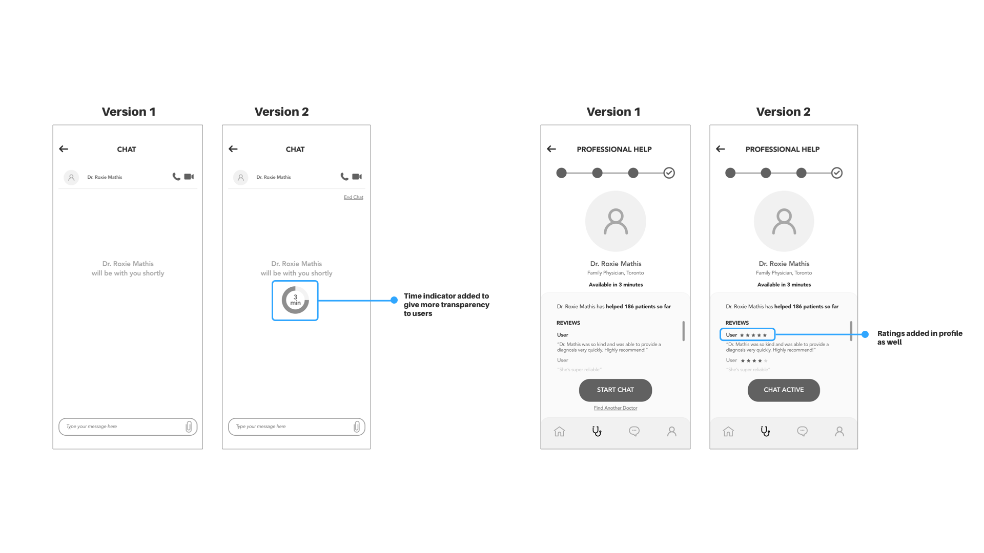
Contacting Healthcare Professionals

Taskflow
SKETCHES AND WIREFRAMES
The next step was to gather inspiration and start ideation and sketching. I sketched out multiple variations of the taskflows and got feedback from peers to guide the digital wireframes.
MEDIUM FIDELITY WIREFRAMES
USER TESTING
My usability testing comprised of 2 rounds, 5 sessions each. The users were given context about the app and then asked to think out loud as they tried to complet
Iterations
The 2 rounds of user tests provided valuable insight on what could enhance the usability of the prototype. Overall, users were able to complete each task and did not face any major usability issues. However, there were many areas for improvements.

The main changes from Version 1 to Version 2 are highighted below:
VISUAL DESIGN
The visual identity process began with putting together a brand moodboard to set the tone for the brand. I picked a palette of blues as the primary colours as its evokes trust and calmess, and works well for healthcare. I also used a muted orange-red as the accent colour.
Logo
App Icon
Colour Palette
Typefaces
FINAL PROTOTYPE
The visual identity was then incorporated into the digital wireframes to create the final prototype.
Next ProjectAll Projects

Let’s build something together.

samiya.sdalwai@gmail.com
Toronto, ON
Top

SD