SD

CASE STUDY

WeClick

Mobile App
View Prototype

About WeClick

WeClick is an app that helps newcomers in Canada connect with one another through interest-based activities and 1 on 1 matches. Activities and people are recommended to users based on compatibility. The app aims to help newcomers in Canada integrate by making meaningful connections.

Timeframe

8 weeks

Tools

Sketch, InVision, POP, Adobe Illustrator, Adobe Photoshop

Role

User Researcher, UX Designer, UI Designer

WHY I DESIGNED WECLICK

As someone who has moved around a lot over the years, I’ve experienced first hand how difficult it is to build a new social life and make meaningful connections. As a newcomer to Canada, I recognized the need for people to connect with others and make new friends in order to make the integration process easier. This sparked the idea for WeClick.

THE PROCESS

I followed the Double Diamond design methodology for this project. The two diamonds represent a process of exploring an issue more deeply (divergent thinking) and then taking focused action (convergent thinking).

Discover
Research
Define
Analysis
Design
Ideation
Deliver
Prototyping
THE PROBLEM

The problem I was tackling was -- the difficulty faced in rebuilding a social life and making connections as a newcomer in a country. Moving is a stressful time for most people, especially since they’re leaving behind old friends and family. Newcomers also face difficulty in meeting new people and making genuine connections. As a result, they may struggle with loneliness due to lack of real social interactions.

Defining the Problem Space Statement -
It is challenging for newcomers in Canada to rebuild a social life and make meaningful connections.
PROJECT GOAL
The ultimate goal was to simplify the process of rebuilding a social circle in a new city and improving the quality of relationships built through digital technology.
SECONDARY RESEARCH

6.9% of new immigrants stated ‘lack of social interaction’ as one of the greatest difficulties faced since arrival in Canada

Canada has been welcoming about 300,000 new immigrants each year over the last few years and as of December, 2019 there were 642,480 international students in Canada. Moreover, numerous locals relocate to different cities for work each year. As the number of new residents in Canada continues to grow, so does the need for resources aimed at helping them integrate. Although social networking apps like Bumble BFF and Meetup are available, they don’t specifically cater to newcomers in a city.

Existing social networking apps are not ideal for building meaningful friendships. There are currently online forums for new immigrants, as well as platforms like InterNations which are aimed at connecting expatriates in a new city. But no existing solutions provide a convenient and meaningful experience for newcomers looking to build real friendships.

PRIMARY RESEARCH
As part of the primary research, I conducted an online survey and user interviews to gather quantitative as well as qualitative data. The goal of the user interviews was to better understand the problems faced by newcomers in Canada.  I dug deeper into the problem space trying to pin-point the areas that warranted digital intervention or a need for a solution.

I then synthesized the data from the interviews, categorized the data points into themes and drew the main insights. The findings from my research helped me refine and craft my final design problem question.

INSIGHTS
People want to build deeper connections with othersPeople build deeper connections in smaller groupsPeople are looking for authenticity in connections made onlinePersonality plays an important role in how well people connectPeople find it easier to bond  over common interests and activities.People want their friendships to feel organically developedNewcomers in Canada have a need to make new friends right after movingPeople connect over similar life experiences
THE DESIGN QUESTION
How might we help newcomers in Canada organically build friendships through organized activities?

PRIMARY PERSONA
After synthesizing the interview findings, I crafted the user persona based on the needs and pain points of the interview participants. Since Human Centred Design aims to keep users at the center of the design, this was a crucial step of the design process.
EXPERIENCE MAP
I mapped out the overall experience my persona would go through to find ways to meet people and make new friends in a new city. I made note of the different touch-points and channels as well as the emotional experiences of the persona. I then identified the various opportunities to help the persona.
OPPORTUNITIES FOR INTERVENTION

1. Providing an easier way to meet new people in the city.
2. Connecting the persona with other newcomers in the city.
3. Assisting the persona in finding things to do in the city.
4. Help the persona find real friends and make real connections.
5. Reduce the time and effort spent on browsing different events and options.
6. Provide a meaningful way for people to connect.
7. Create a platform to explore fun activities and people to meet up with.

TASK SELECTION
Based on the opportunities of intervention from the experience map and the persona's needs, I drafted 35 user stories which were then categorized into epics.
click to enlarge
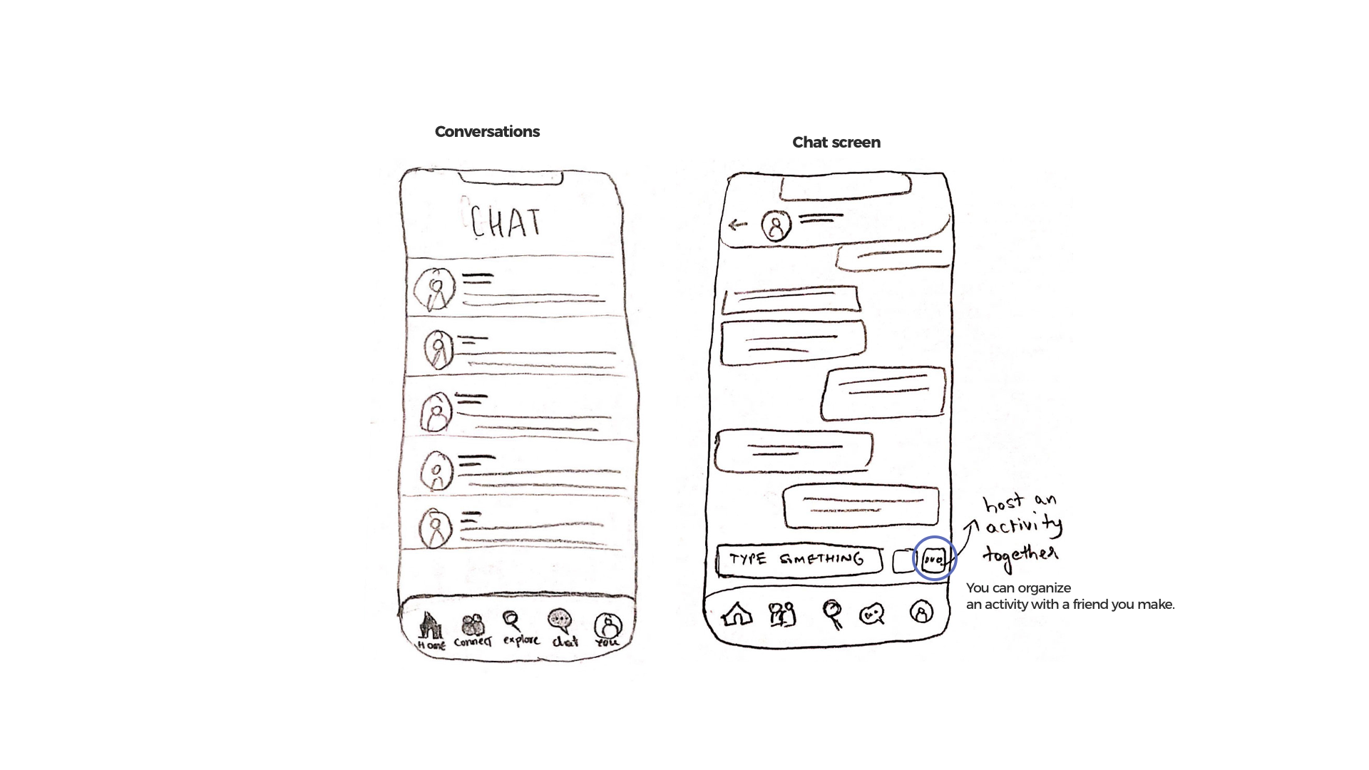
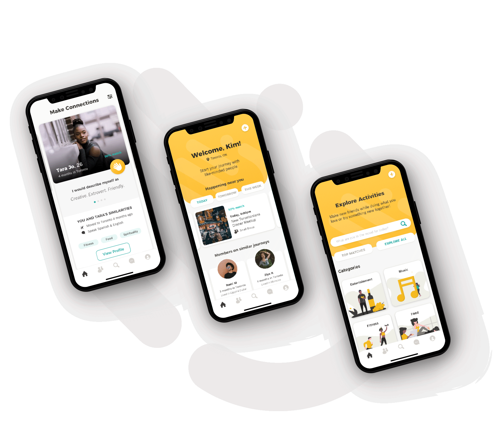
I then chose the main epics that would tackle the needs of the personas and best address the design problem. The two main epics were Explore Activities and Connect With People.
Primary Task

Join Activity

Secondary Task

Connect with Other Users

SKETCHES AND WIREFRAMES
The next step was to gather inspiration and then start ideation and sketching. I experimented with multiple variations then stitched them into paper prototypes to get feedback from peers in order to have better direction while digital wireframing.
click to enlarge
MEDIUM FIDELITY PROTOTYPE
I incorporated the feedback I received on the sketches and created a digital prototype to start usabilty tests.
click to enlarge
USER TESTING
My usability testing comprised of 3 rounds, 5 sessions each. to complete over a 15 minute test session. The users were given context about the app and then asked to think out loud as they tried to complete each task.
Iterations
The 3 rounds of User Tests provided valuable insight on what the prototype was lacking and where it could be improved. Overall users were able to complete each task and did not face any major usability issues. However, there were many opportunities for further improvements.

The main changes from Version 1 to Version 3 are highighted below:
VISUAL DESIGN
The visual identity process began with putting together a brand moodboard to set the tone for the brand. To set a warm but playful tone to the app, I chose a palette of yellows as the primary colour along with teal as the secondary. I gathered words that conveyed the feel of my brand along with images and typography inspiration.
Moodboard
click to enlarge
Logo Concept
Final Logo
Colour Palette
App Icon
Typography
FINAL PROTOTYPE
click to interact
MULTI-PLATFORM ADAPTATION
After revisiting the experience map and analyzing the persona’s needs, I started to consider the different platforms that would add value for WeClick’s users.  I decided to adapt the product for apple watch as I believes that it could bring value to existing users to view and respond to notifications on the go, and have quick access to upcoming events and reminders.
NEXT STEPS
My biggest takeaway from this project was that no matter how well-designed your product might be, there is always room for improvement. And that's what is next for WeClick. I plan to take this project further and build out the remaining parts of the app. I would also like to continue conducting more rounds of user tests to get more feedback on the high fidelity app. I’d also like to expand and build more upon how users can host their own activities and what that might look like for users. Along with this, I’d also like to design the micro-interactions and added delights for users.
KEY LEARNINGS
This 8 week project pushed me to my limits and helped me learn and grow in a very short time. It came with a series of ups & downs and many takeaways and learnings. One my the main learnings was to detach myself from my work. I learnt the value of getting feedback in the early stages of the process before building any attachments to my designs.‍ail fast, fail often” was the mantra that guided this test-driven development process.I also learnt that the product is never really finished, meaning that no matter how good a product might be, it will constantly evolve and there will always be room for more improvement.
All ProjectsNext Project

Let’s build something together.

samiya.sdalwai@gmail.com
Toronto, ON
Top

SD