Modernizing the Sign In and Account Creation experience for Albertans accessing online Government services

Designing a configurable platform for the Government of Alberta’s emergency payment programs

Experience Redesign
Visual Design
Responsive Web
Single Project Image

At a glance

A multi-phase project to unify, simplify, and rework Alberta.ca Account — the authentication layer behind a wide range of Government of Alberta digital services.

My Role

Senior Product Designer

Owned the sign in and verification experience.

Drove visual design enhancements.

Scope

Sign in and Account creation for personal and business users

Account verification

Parallel workstreams: Account management, recovery, and re-verification.

Outcomes

Unified sign in launched for business and personal users, replacing the disjointed legacy paths.

Shipped rebuilt account creation flow.

Background

Alberta.ca Account is the authentication layer for a wide range of Government of Alberta online services for individuals and business organizations.

‍In 2023-24, there were 2.5 million active basic (unverified) and 1.3 million verified Alberta.ca Accounts allowing Albertans to access government services and programs online. Because it sits in front of so many services, users land on it via redirect rather than seeking it out, and that context shapes the design problem. Data revealed that 394,000 users had started verification and abandoned it. The contact centre also received a high volume of calls due to account and verification related issues.

The project was a two-phase modernization. Phase 1 unified the back-end under a single sign in entry point with a light UI refresh, but didn't address the underlying experience. Phase 2, where I joined the team, addressed the end-to-end flow: simplifying sign in decisions, reworking account creation, and reducing friction.

The Problem

Synthesis of existing user research, performance analytics, contact centre call theme review, and workshops with business leads surfaced these overarching pain points:

My Role & Methods Used: Synthesis of existing user research, performance analytics, contact centre call data review, and workshops with business leads.

Constraints & Challenges

Alberta.ca Account is an authentication provider for downstream services, not a standalone product. Design decisions had to hold up across an unknown range of service contexts.
Sign-in and account creation experiences needed to be unified for business and personal users since the broader account management experience would be unified shortly after.
The brand transition from MyAlberta Digital Identity to Alberta.ca Account was in flight and not fully communicated across the surfaces users were arriving from.
Account recovery, which was a major pain point given infrequent use, was being handled by a different team and was out of scope for this work.

Design Objectives

How Might We

Introduce Alberta.ca Account to first-time users arriving via redirect.

How Might We

Unify sign-in across business and personal users into a single, coherent entry point.

How Might We

Redesign account creation so it feels guided, reducing time spent and cognitive load.

How Might We

Make account type and verification decisions clearer and more contextual.

Concept Testing

We built up the flows in low-fidelity wireframes first, then prototyped in Figma for concept testing across  two rounds of five participants. We used scenario-based walkthroughs covering account creation, federated sign in, verification through to the mailed activation code, and post-verification entry to a downstream service.
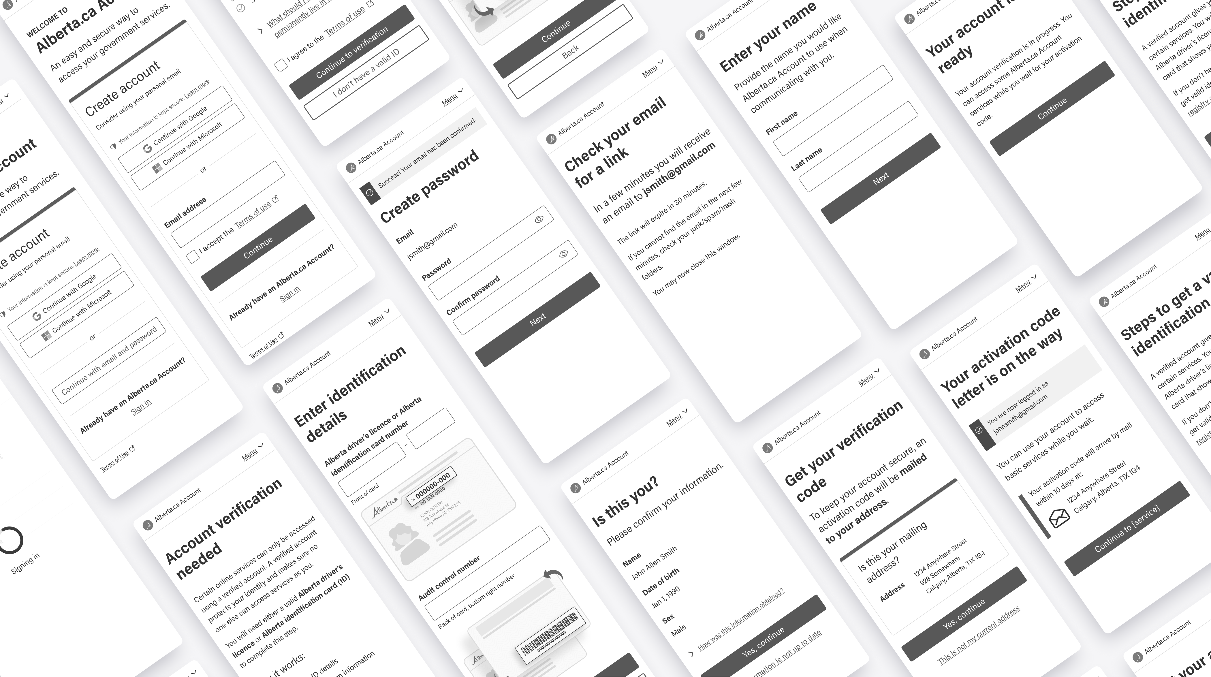
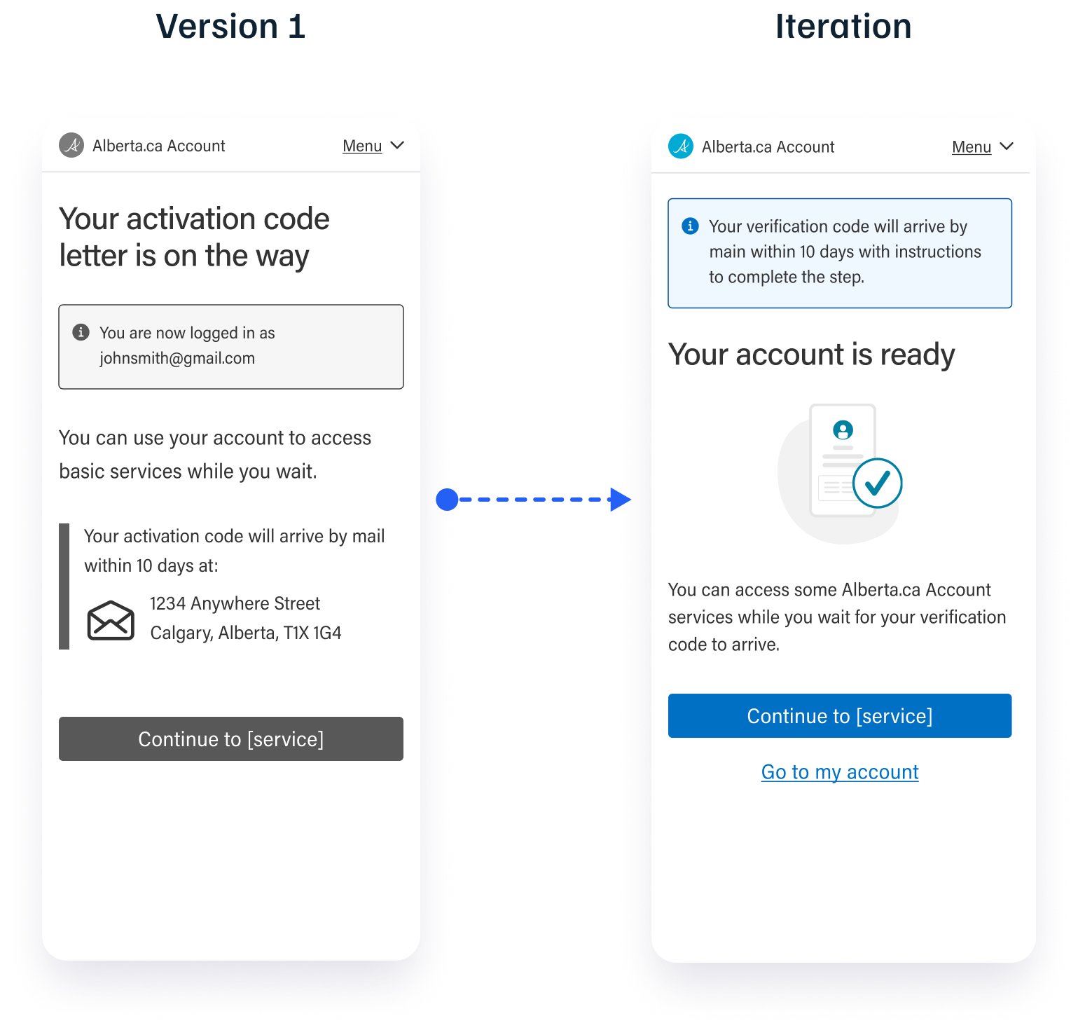
A few iterations directly tied back to testing:

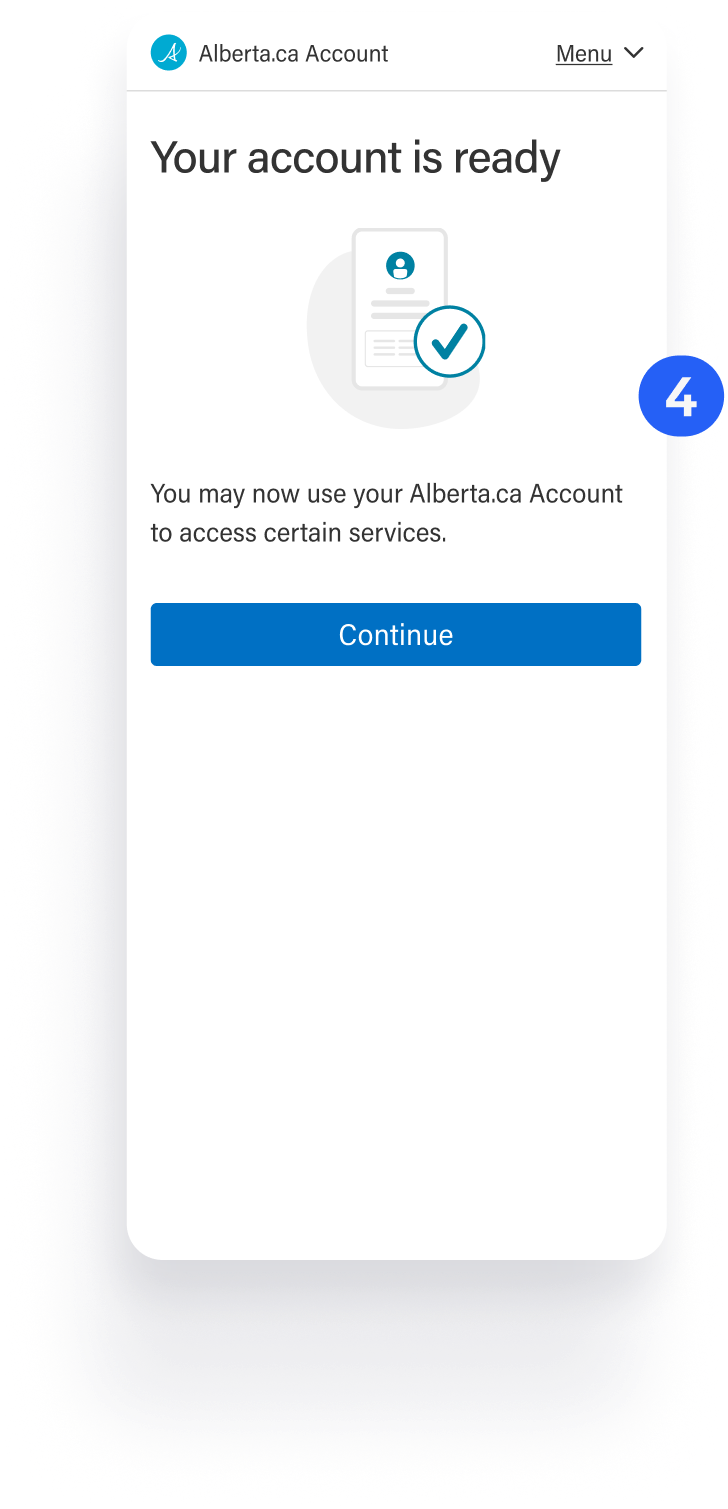
Users expressed a lack of certainty in the completion of their account creation on the final screen.
Account creation completion was made clearer at the end of the verification step.
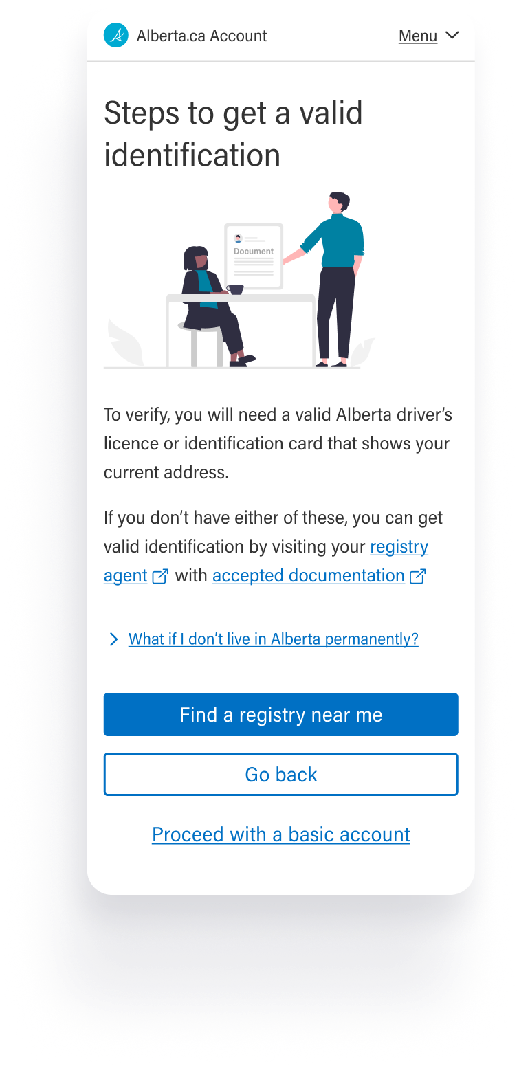
Participants without a driver's licence, or outdated licences needed clear information on their path forward.
The verification unhappy path was made more prominent and enhanced with added guidance.
Business stakeholders had pushed to fit verification information on one screen, assuming fewer screens would mean a simpler process.
I recommended testing variations to validate, which confirmed that users spent longer on the section when information wasn't logically split into smaller steps.
Users moved through steps faster as information was split into smaller steps.
Supporting information was added to answer commonly surfaced questions.

Design & Delivery

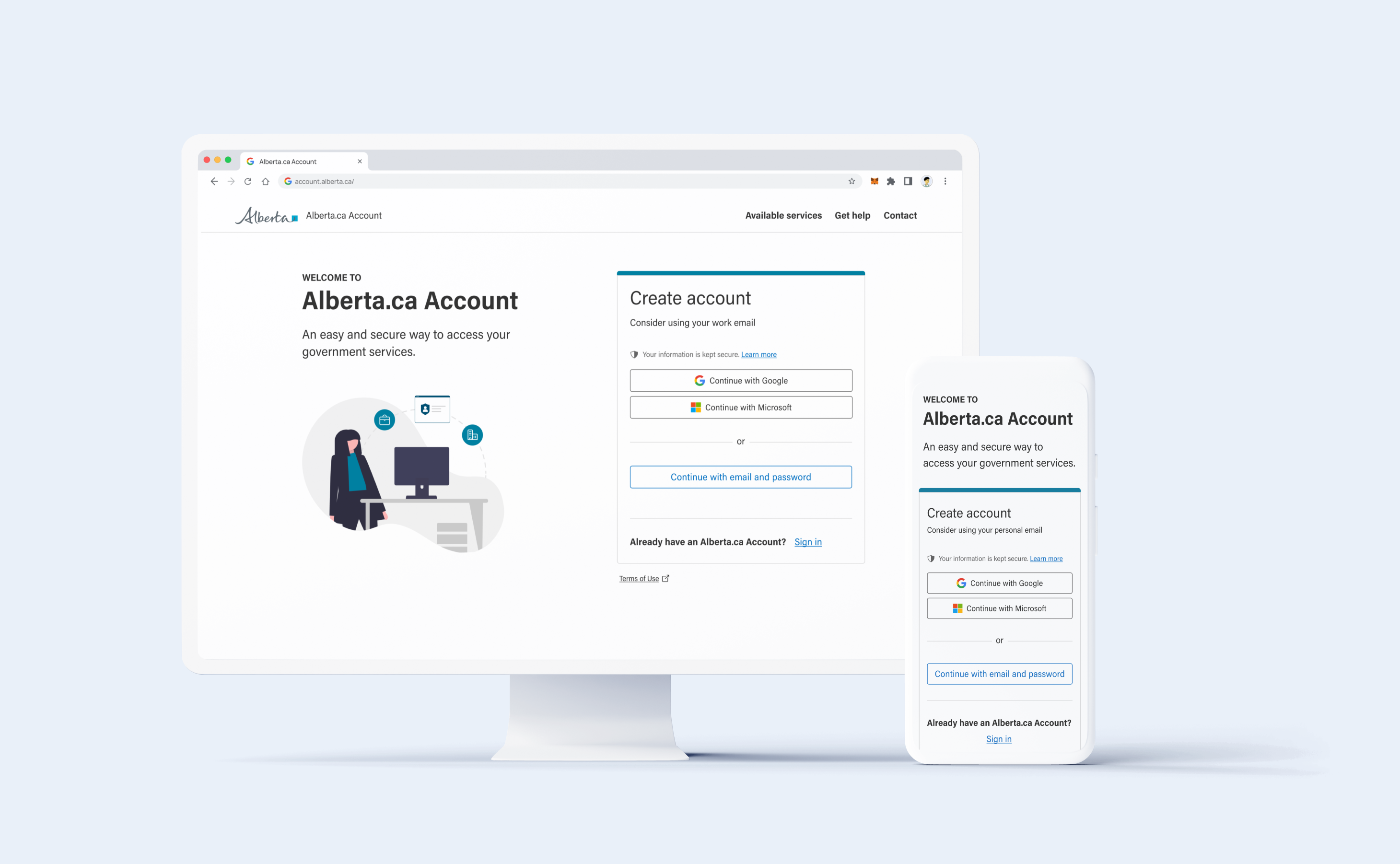
A unified Alberta.ca Account sign-in and account creation experience that meets users where they are, typically arriving from a downstream government service. My scope of work for the redesign covers: Sign-in, Account Creation, and Account Verification.

My Role & Methods Used: Wireframes and design explorations for account creation with verification flow and sign in experience, rapid prototyping for testing. Partnered with Service Design and Front-End Designers to conduct usability testing and synthesize findings.

Sign in Experience & Triage for Account Creation

Alberta.ca Account now detects the upstream service that directed the user to create an account and routes them automatically to the appropriate account creation flow.

Simplified single sign in for power users with federated options surfaced for ease of use.
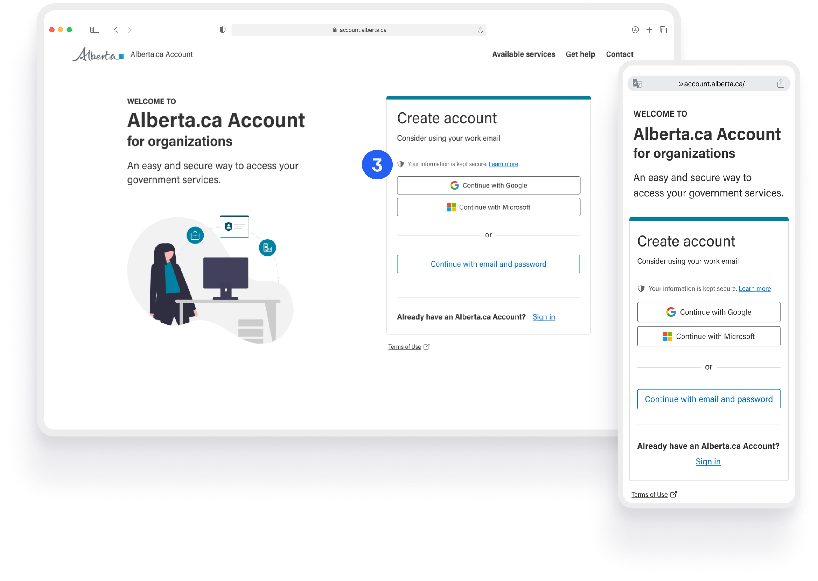
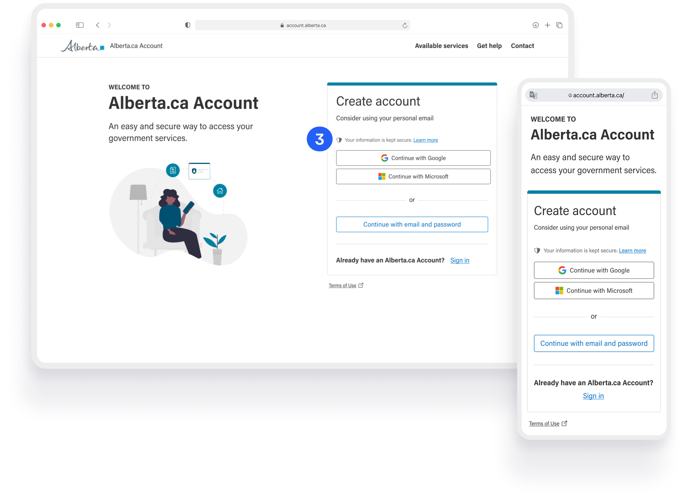
Unified sign in and entry point for personal and business account creation.
Privacy disclosure surfaced on top to help mitigate user concerns around data privacy.

Create account for businesses

Create account for personal use

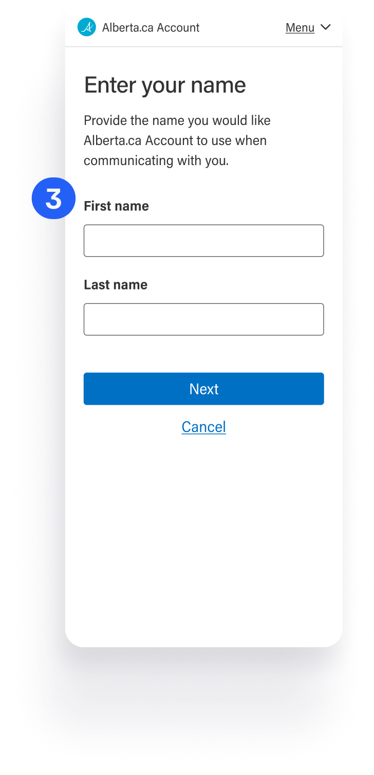
Account Creation Simplified

Users are automatically directed to the account creation flow for basic unverified accounts if the service they are coming from doesn’t require verification.
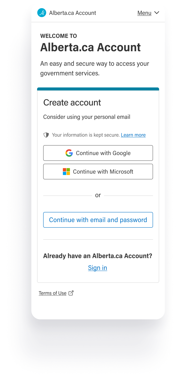
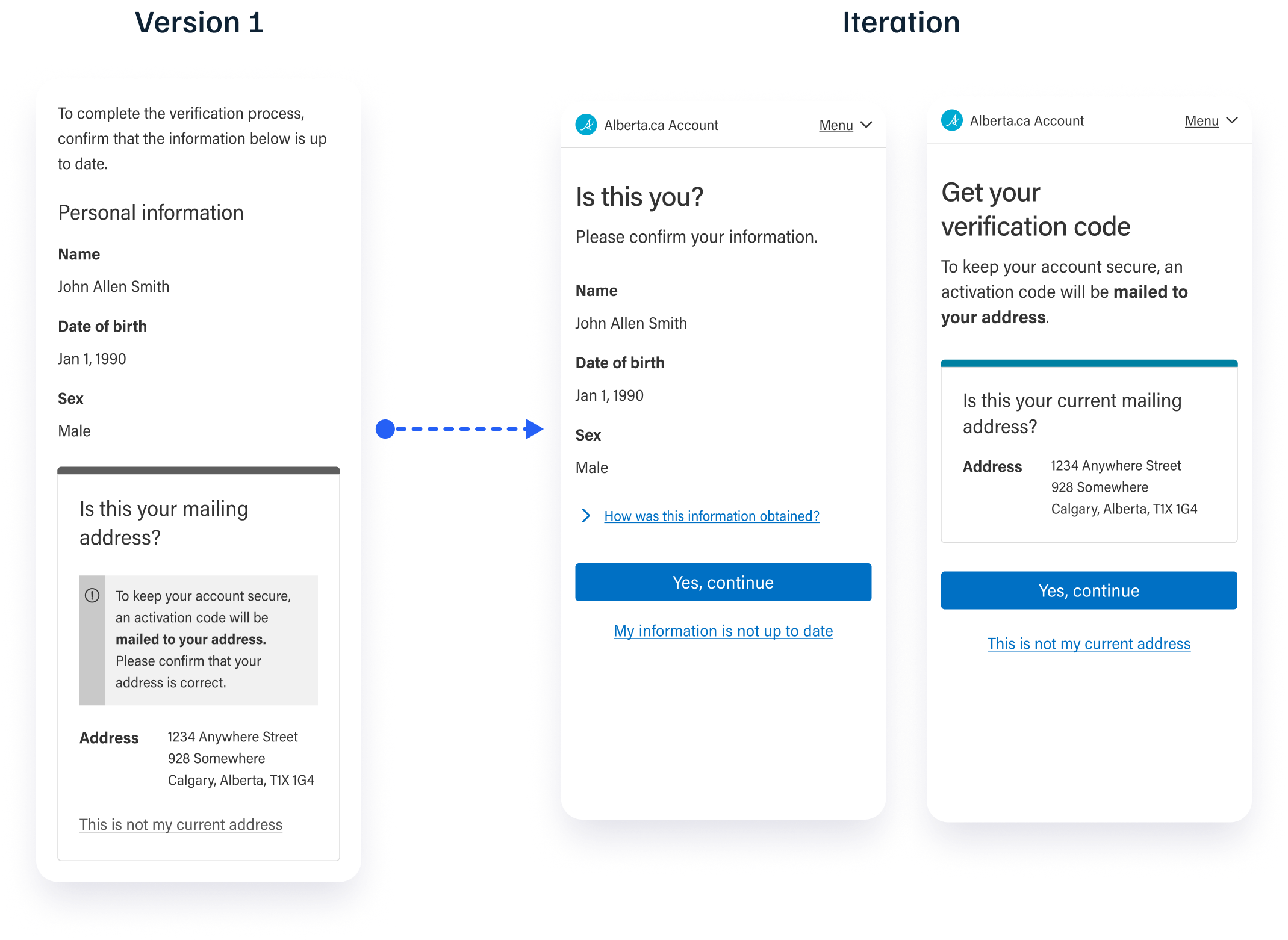
Surfaced email address input and terms & conditions on the initial screen to simplify and optimize the process. It previously had two additional screens for the same process.
Improved how steps are broken down to make account creation quick and seamless.
Only necessary information collected for basic accounts.
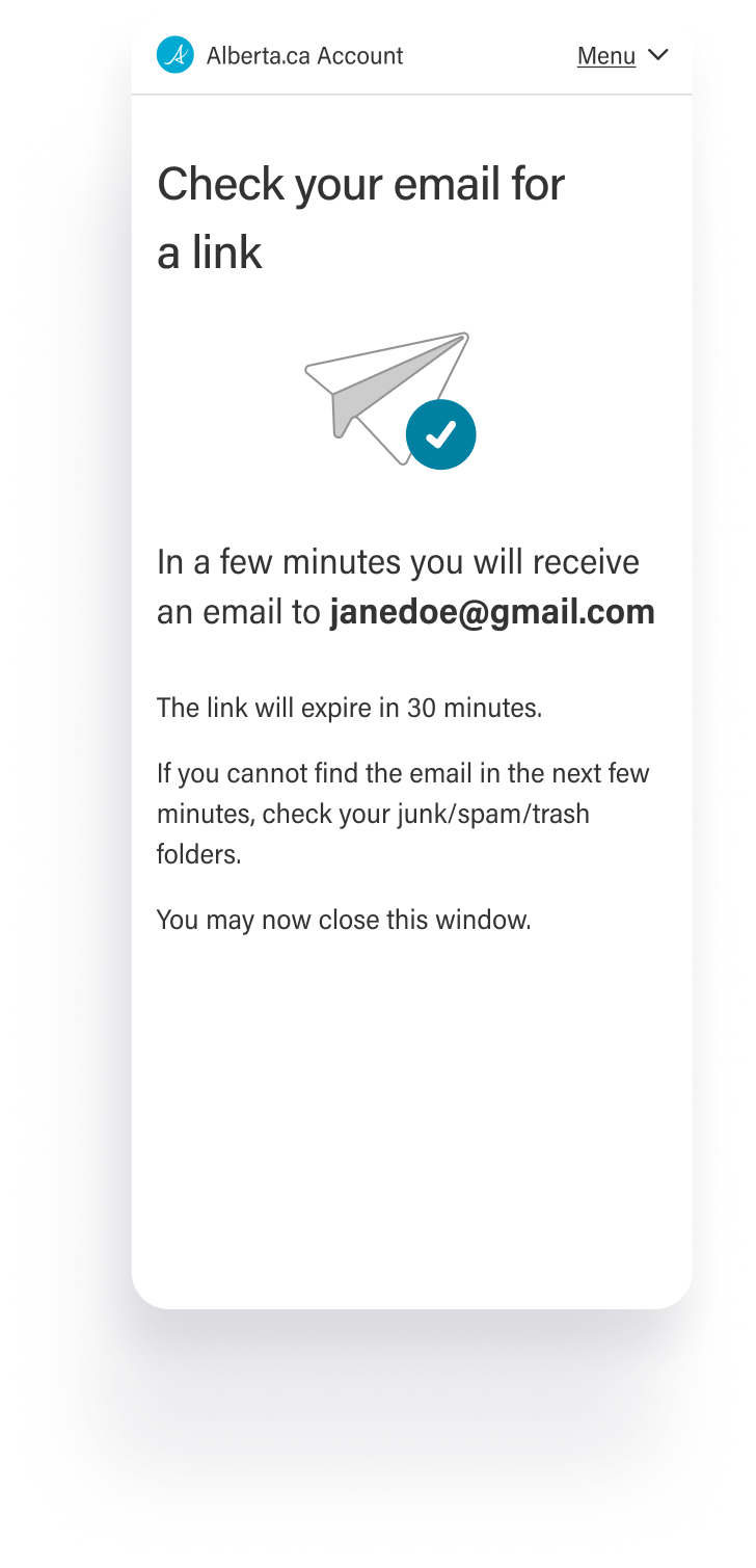
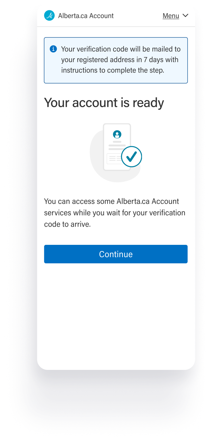
Added clearer confirmation of process completion.

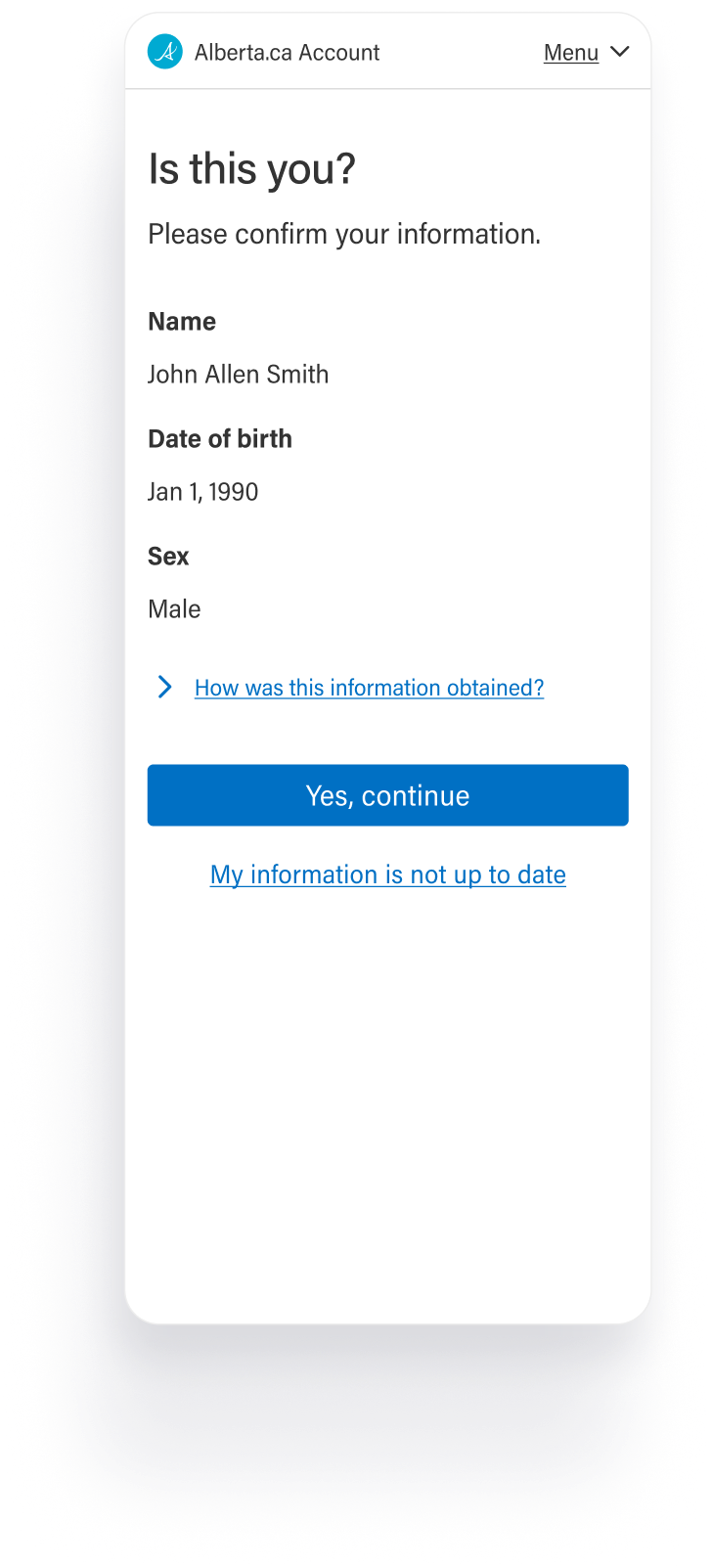
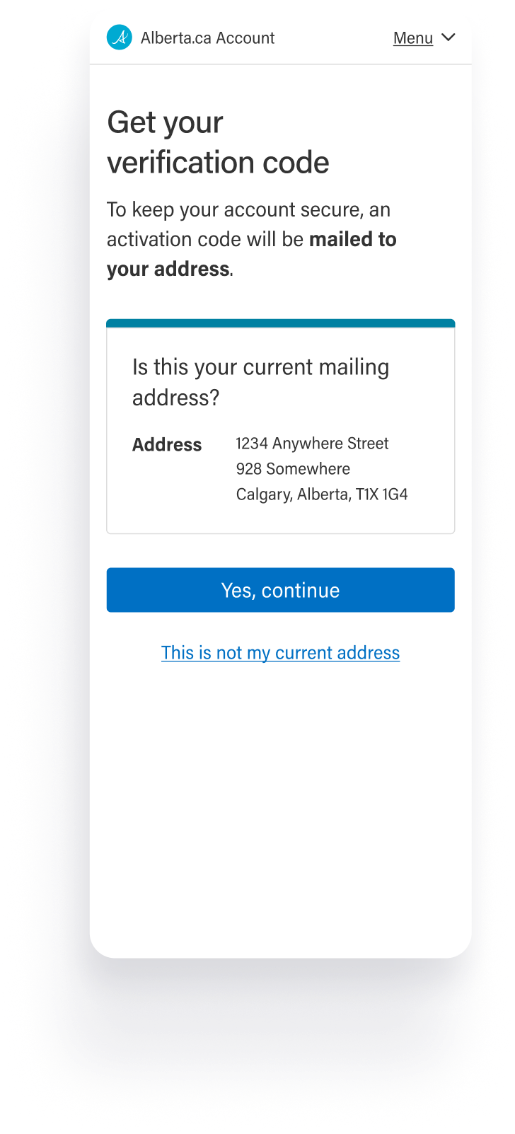
Account Verification Made Conditional

Only users coming from services that require verification are taken through the verification process during account creation.
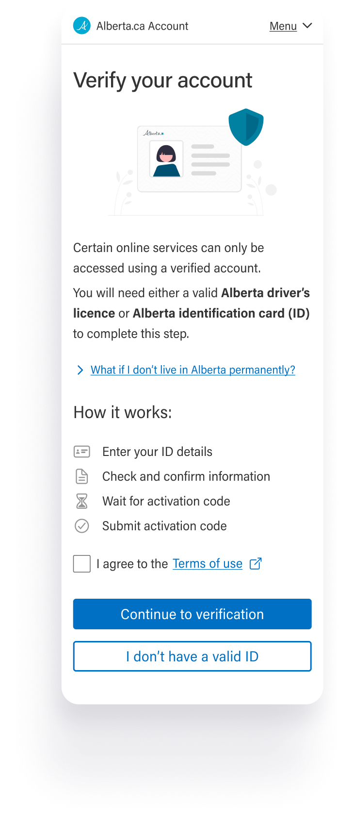
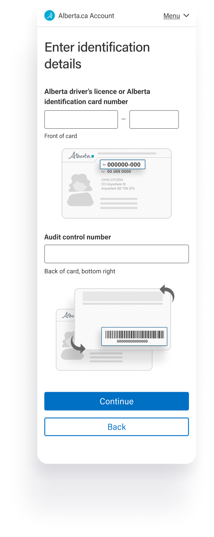
The enhanced verification flow provides contextual guidance throughout the process.
Steps broken down and optimized based on feedback received during testing.
Resolution and guidance options provided at each step for users who may run into barriers during verification.
The verification code screen designed to remain open to the text and phone code channels being rolled out in a parallel workstream.

Impactful decisions

Design decisions and cross-team alignment work that shaped the shipped experience.

Federated sign-in was a user-centric design push, not business requirement led.

Google & Microsoft sign-in were already added in the legacy system but were hidden behind logic that auto-redirected email addresses without surfacing federated as an explicit choice.

I surfaced user feedback from concept testing, where participants gravitated to federated options when they were visible, and gathered evidence from industry trends to advocate for and secure buy-in from business stakeholders to bring federated options to the top.
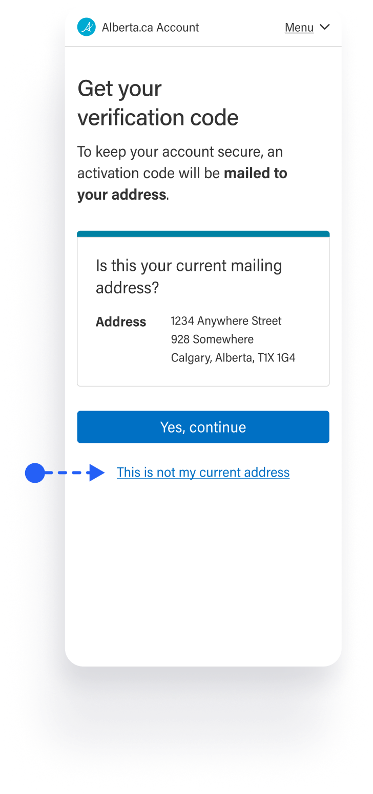
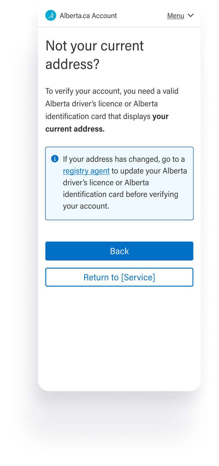
Treating the unhappy path as a common experience, not an edge case.

Accepted verification documents were limited to Alberta driver's licence and ID, so a substantial group of users (newcomers, temporary residents, students) could start verification but never complete it. Upstream program teams and contact centre agents confirmed this was a common experience, not an edge case.

In response, the unhappy path was given deliberate weight, with contextual support at potential dead ends and alternate pathways so users could find resolution and clear guidance.

Delight

I drove UI enhancements that pushed the experience toward the polish expected of a high-traffic, high-visibility public service — redesigning flows for both improved usability and visual finesse, and creating illustrations to support the experience.


Outcomes

Unified sign in launched for business and personal users, replacing the disjointed legacy paths.

Account creation flow rebuilt with progressive disclosure and intent-led account type framing.

Verification decoupled from account creation; account creation completion is now distinct from the verification path.

Qualitative feedback

“It's easier, you know, compared to before… Simple, few instructions. Easy, quick to access.”

(baseline: 20–30 min from staff interviews)

"This is a good thing. Anything you can do to open up the world for those people, for someone who maybe isn't as confident or doesn't have a really good understanding of what the system is trying to do."

(baseline: 20–30 min from staff interviews)

Reflections

Designing with known constraints and friction points.

Some friction points on this project were known going in and outside Phase 2's scope to fix: accepted verification documents were limited to Alberta driver's licences and ID, and verification code delivery was available only by physical mail. Those constraints didn't just limit what could be designed; they created real pain points for users, and the UX had to accommodate them directly rather than treat them as edge cases. What I take from this is that sometimes the design's job isn't to remove or disguise friction, but to address it and ensure that the user has somewhere to go with a clear understanding of why.

Treating sign in and account creation as the second leg of the journey instead of the starting point.

The legacy flows had been designed as if users came to them deliberately. They didn't. Most arrived via redirect from a downstream service, mid-task, without recent account memory. Treating sign in and account creation as part of a journey that started somewhere else was a small reframe in the moment, but helped clarify a lot of what came after. Getting the framing right early made every subsequent decision easier — that's not always where I would have looked for guidance on a project.

Articulating design decisions and backing them up with data.

Usually, articulating design rationale and how it supports business goals is enough to get stakeholders on board. On this project, the business leads came in with strong personal visions of what the experience should be, and design reasoning on its own wasn't carrying the weight it usually would. What consistently bridged the gap was evidence: user data from discovery, concept testing findings, industry trends, and concrete examples from comparable services. Bringing evidence in changed the tenor of the conversation and gave suggested UX improvements the weight to be taken seriously, often through delicately challenging assumptions being held as fact without putting stakeholders on the defensive.
Back to homepage
Back To Top Icon