Designing a configurable platform for the Government of Alberta’s emergency payment programs

Designing a configurable platform for the Government of Alberta’s emergency payment programs

Replacing legacy systems with a platform that ships programs in days.
Platform Design
Responsive Web
Strategy
Single Project Image

At a glance

A multi-surface platform that replaces program-by-program rebuilds with a reusable system.

My Role

Lead Product Designer

Co-led concept work and platform design strategy across all interfaces.

Owned the staff workspace experience end-to-end.

Led foundational design work for the public application.

Scope

Admin Configuration Portal

Public-facing Application Portal

Staff  Workspace

Outcomes

Over 50% faster program spin-ups for launch.

~ 33% reduction projected in time spent on adjudication.

2 new programs in intake.

Reduction in volume of in-person support.

Background

Every year, the Government of Alberta launches emergency payment programs to disburse funds to Albertans affected by events like natural disaster evacuations. Legacy systems are reused out of necessity, and each year’s launch leads to duplicated effort, compressed test windows, compromises on applicant and staff experiences, and overtime work across business and technical teams for a timely release.

The brief was to build a platform that allows business programs to configure and launch new emergency programs end-to-end faster and without redoing the technical and design lift every time.

The Problem

The pain point wasn't a single feature, one broken experience, or focused on a couple of user personas; it was a complex organizational pain stacked across four groups:

1

Alberta Residents

Applying for disbursements during emergency situations.
Long, mobile-unfriendly applications with no feedback or status. No save-and-resume. High volume of support calls and in-person visits.

2

Staff

Adjudicating applications and authorizing payments.
Multiple unintegrated systems for a single adjudication. Manual data copying. Legacy systems that relied on operational training for staff users.

3

Program Owners

Working with delivery teams, responsible for the end-to-end.
Every content update and rule change needed engineering. Compressed windows for testing. Public and staff experience trade-offs for timely launches.

4

The Organization

A collection of Ministries with similar program needs.
Each new program duplicated work with limited reusability. Inefficiencies were evident in time and costs associated with each program.

My Role & Methods Used: Facilitated cross-team workshops & interviews with staff and program owners, journey mapping of the legacy adjudication path, observational research during previous program launches.

Constraints & Challenges

Brief vs. Reality

Leadership asked for a platform but the tight delivery timelines pushed the team toward building a pilot program well, and took focus away from the platform as a whole.
A first proof-of-concept was scrapped and restarted because the architecture had drifted from platform goals.
Limited access to future programs meant we couldn't always validate whether a need was program-specific or platform-worthy.
A lean team meant designers also carried service design, content writing, requirements distillation, and system-testing support.

Making sure we Build the Right Thing
before we Build it Right

Objectives

Everything in my approach, design decisions, and expected outcomes was influenced by the overarching objectives we defined in alignment with stakeholders and leadership.

Replace recurring program rebuilds with a configurable platform. Starting with a flexible structure for future programs.

Make the staff workspaces intuitive, not training-dependent; optimize workflows to save time and reduce the potential for human error.

Align with broader organizational goal of operational cost reduction, fewer card payments, and less need for in-person support.

Defining the Solution

The aggressive target timelines called for strategic and relentless negotiations on MVP scope. I facilitated workshops and discussions to hold up each feature request next to the platform’s objectives, weighing its impact against the cost and effort to build.

We also identified higher value features that were not in the original scope.

Quick Wins

Automated approvals
Editing payment type
Payment failure handling
UI enhancements

Worth the effort

Eligibility assessor
Follow-up management
Integrated card payments

Revisit later

Program owners self-serve admin
In-app notifications
Widget-based form builder

Evidence-based
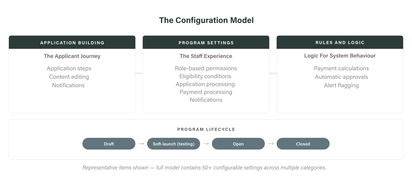
configurability

Our guiding principle: build the system flexible enough to absorb future configurations, but only fully build out configurations we had evidence multiple programs needed.

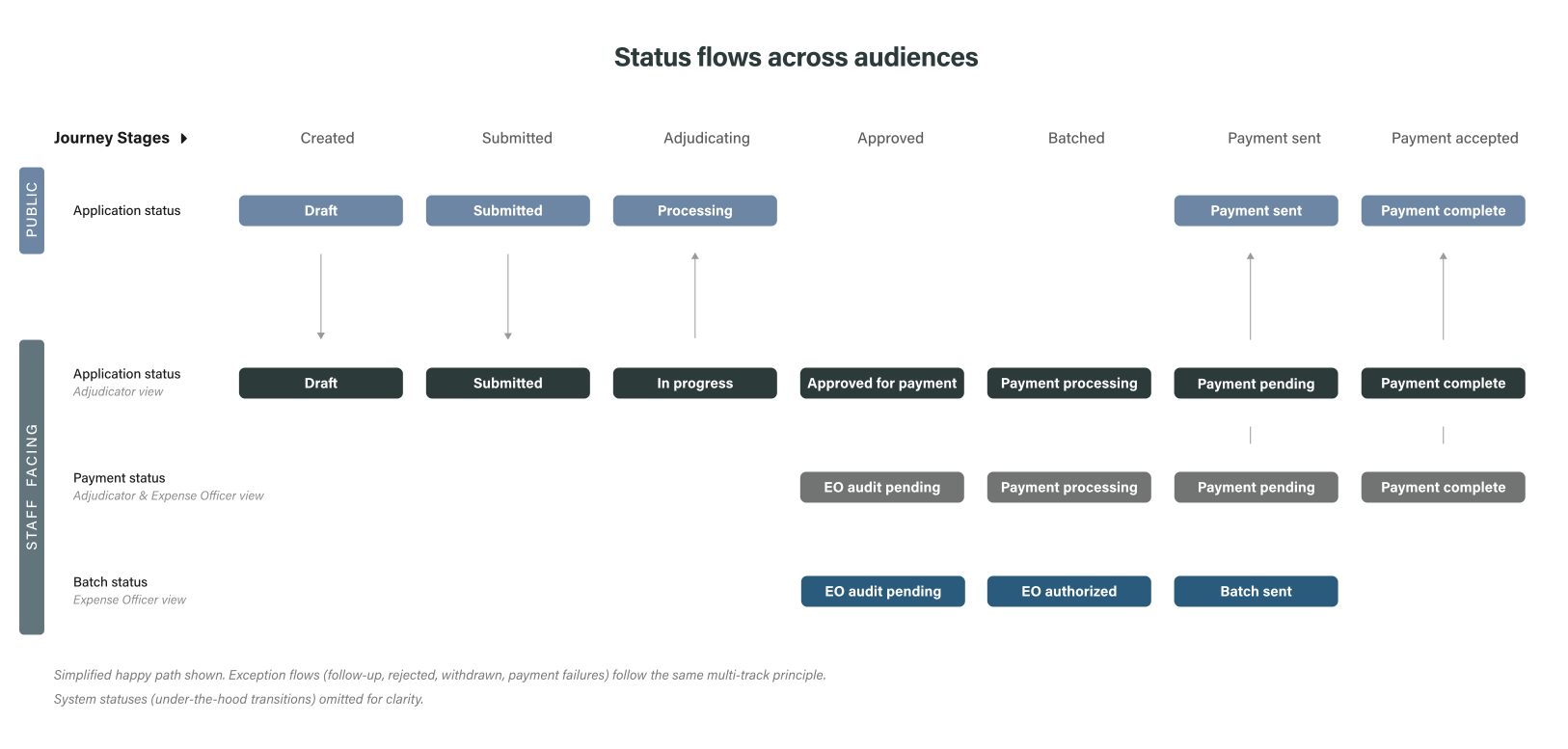
Status flows

Designing the audience-visibility based status flow was vital to the service design. The adjudication staff and expense officers work with parallel status tracks; the application portal updates the applicant only at significant moments.

My Role & Methods Used: Ran workshop sessions for status-flow diagramming with engineering and alignment meetings with stakeholders to validate that the model met user needs. Conducted program owner and staff interviews to map workflows and processes.

Design & Delivery

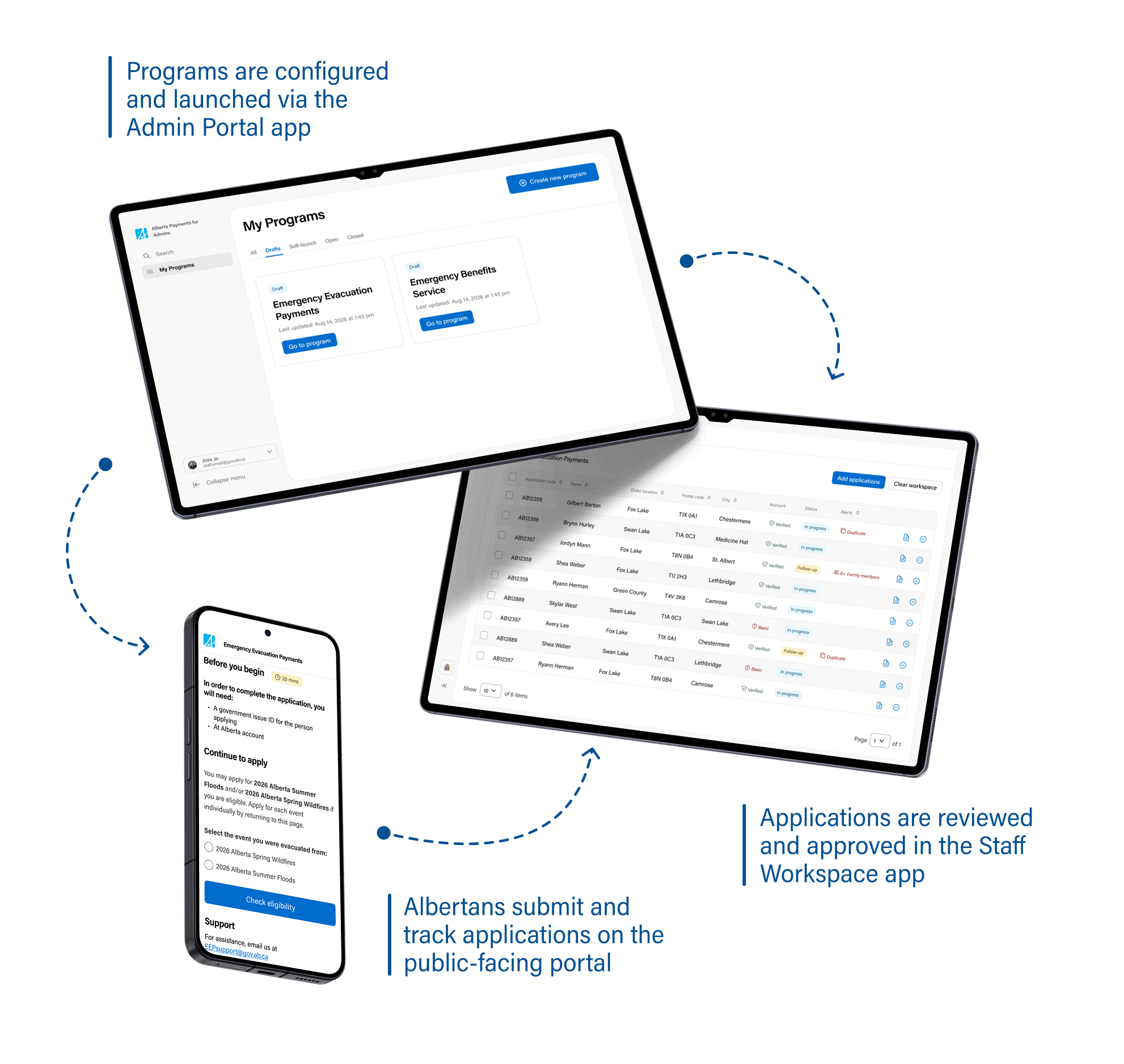
The platform spans three surfaces — a public application for residents, a staff workspace for adjudicators and expense officers, and an admin portal for program owners.

My Role & Methods Used: Drove initial concept designs for all three interfaces; owned staff workspace designs end-to-end. Multiple rounds of wireframes and iterations, stakeholder alignment and reviews, and user feedback sessions. Embedded in an agile scrum team, providing guidance and support for development & testing.
The solution at a glance

A program owner configures a program in the admin portal, which drives what Alberta residents see in the public application and what adjudication staff and expense officers work with in the staff workspace.

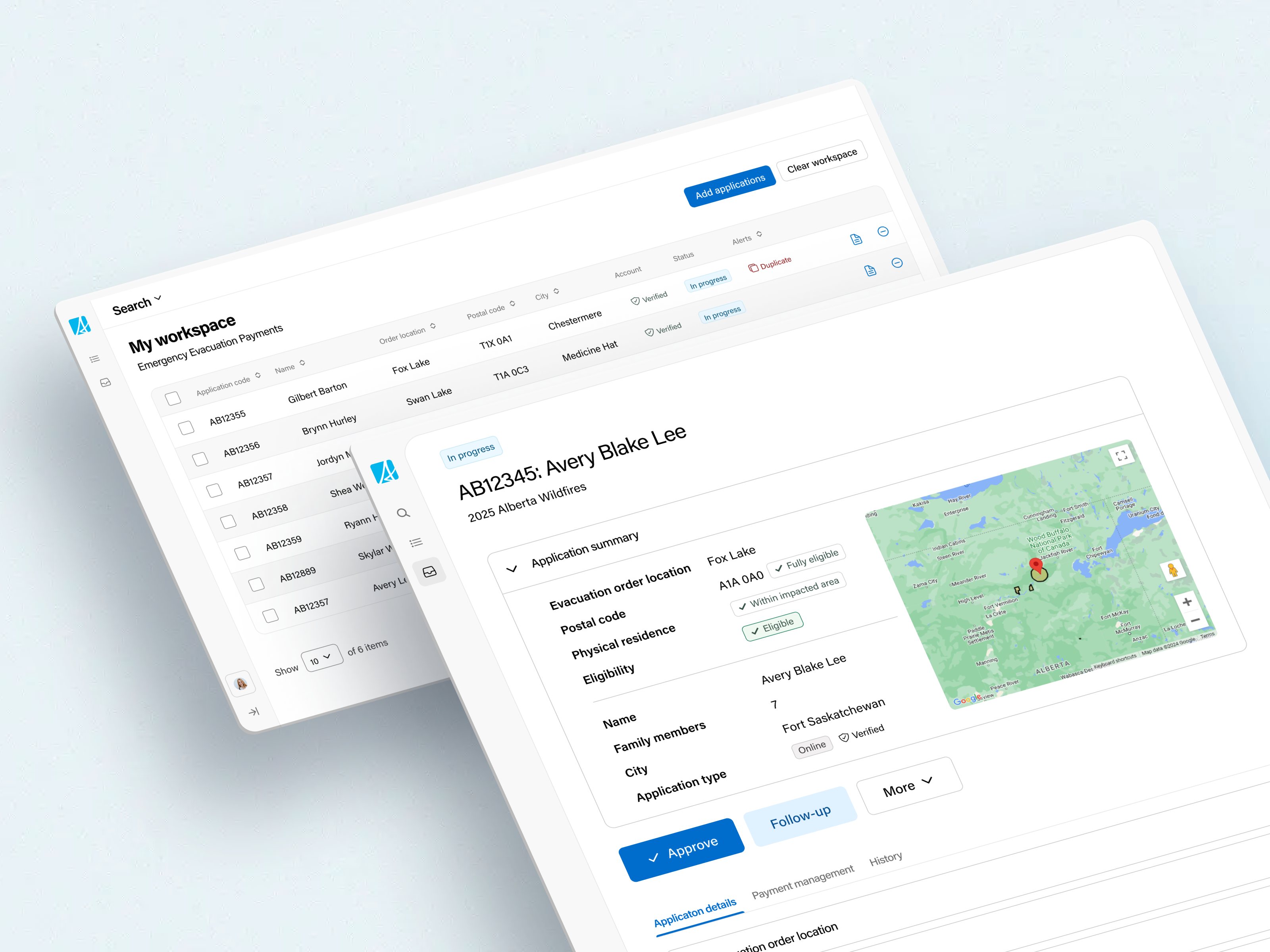
Staff Workspace

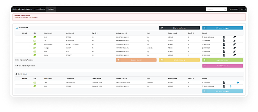
The new staff workspace draws from established patterns across existing applications while targeting the issues specific to our user groups. The legacy system relied on training, and the business had flagged that training often isn't enough for emergency programs due to the pace of work they demand.

1

Workspace dashboard

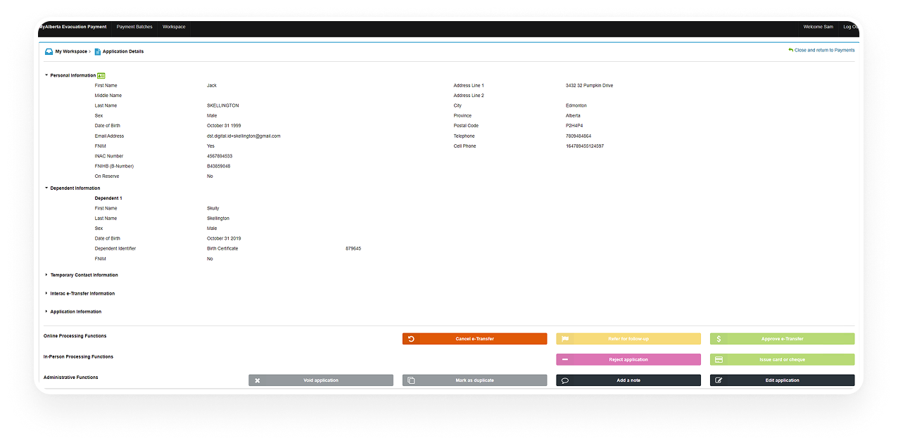
Before  

Needs & Pain Points

Legacy system displayed every action in every state.
The workspace was not role-specific, leaving it to the users to know what is relevant to them.
Staff referred to a glossary of icons to learn the non-standard iconography usage in the system.

The Redesign

After  

A status and role driven workspace, that only displays the actions relevant to each user role appropriate in the current state.
Badges and icons used intentionally with supporting content and hover text - keeping in mind that a lot of users are seasonal staff, not power users.

2

Application Review

Before

Needs & Pain Points

Information was buried and relevant actions were not intuitive or easy to identify.
Important details for decision-making had to be sought out, relying on system training.

After  

The Redesign

Summary section surfaced, containing most frequently checked details.
Alerts highlighted on top of each application.
Information restructured and categorized based on staff workflows.

3

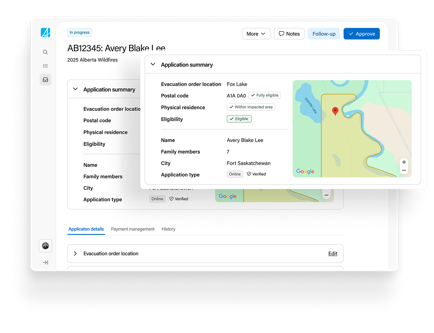
Eligibility assessor in application summaries

For evacuation programs, eligibility hinges on whether an address sits in an eligible postal code or evacuation polygon.
The automatic eligibility built as a program-specific feature flag for evacuation payment programs to reduce time spent on decision making.
It integrates multiple data sources to eliminate the need for staff to switch between various systems and spreadsheets during application review.
While the UI is unassuming, the feature relies on complex logic and delivers big impact for staff.

4

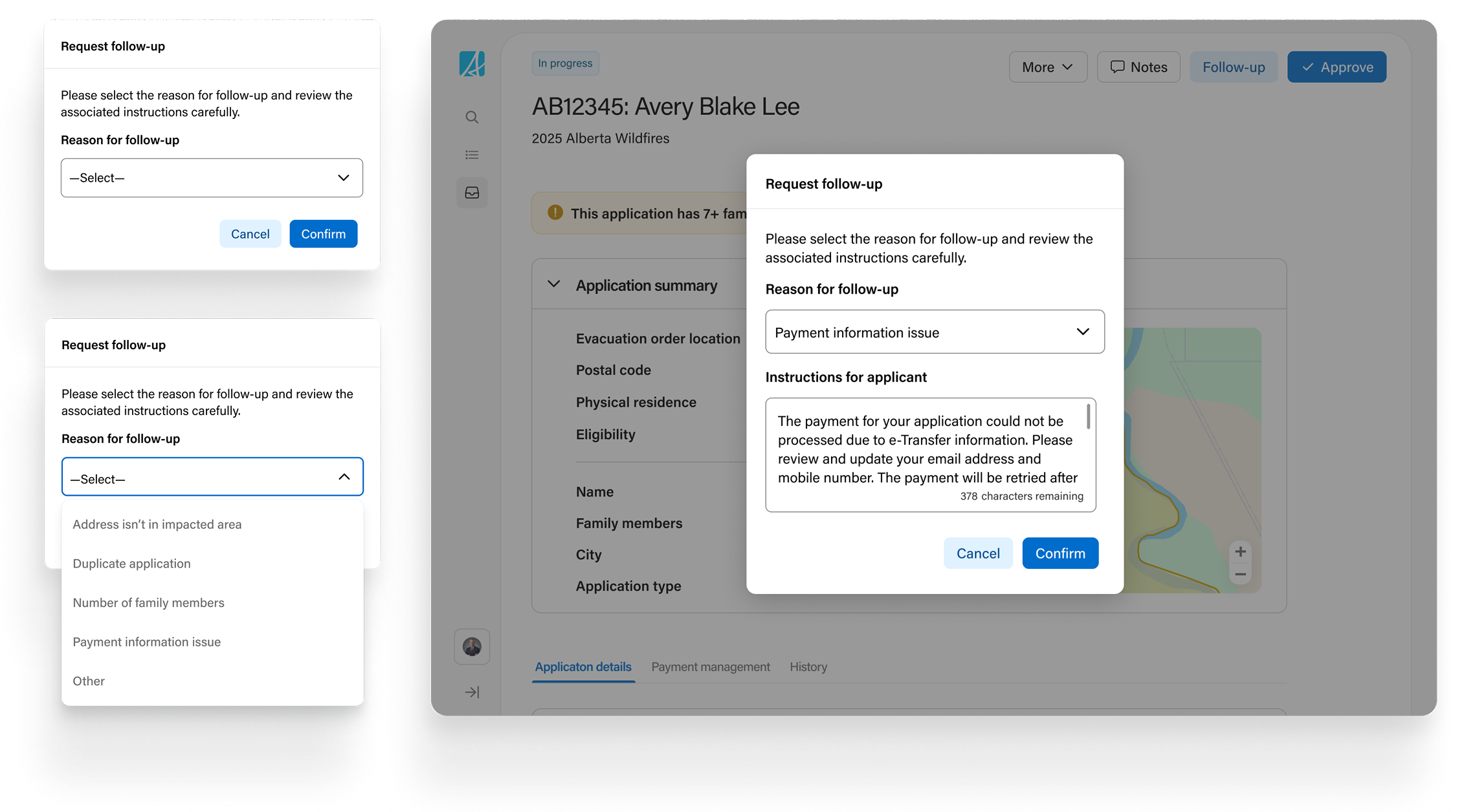
Follow-Up Management

The legacy follow-up flow was rigid. Staff set an application to follow-up, the applicant was notified to visit in person, and nearly all of those visits ended in a prepaid card payment.
Programs can now define their most common follow-up reasons in the admin portal, along with templatized instructions to send applicants.
The application is made editable for the applicant while in follow-up so they can make updates based on instructions without visiting in person.

5

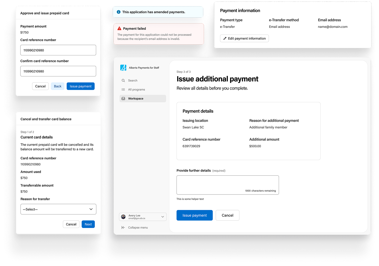
Payment Management Upgrades

Integrated prepaid card payment provider, replacing previous workflow that required switching between multiple systems.
Enhanced error handling for online payments, aimed at reducing in-person card payments resulting from failed online payments.
Ability to manage payment type and issue additional payments — a gap in the legacy systems.

Outcomes

Over 50% faster program spin-up

Compared to legacy launches, with overtime and weekend work eliminated entirely and a smaller team. Pilot program was configured and go-live ready in 5 working days.

Design engaged from kickoff on subsequent platform work

A huge feat for design advocacy and maturity on the team due to earned trust.

2 additional programs in intake on the platform

Business programs displaying interest in re-platforming to Alberta Payments has been an early signal of success.

To be measured post program:

~33% reduction in staff adjudication time on complex applications

(baseline: 20–30 min from staff interviews)

Reduced in-person support volume

(baseline: ~30% in-person payments last year)
Driven in part by the follow-up redesign and new error handling.

Increasing shift to online payments from prepaid cards

Driven in part by online resolution of failed payments instead of in-person card issuance.

What’s In The Pipeline

User feedback and enhancements

Business & Staff Experience: A parallel work stream has been set up to gather data and user feedback from the pilot program for continuous improvements.
Public Experience: User testing and enhancements to the applicant experience.

Platform phase II

Iterating on the configuration model based on new programs interested in being onboarded to the platform.
Expanding the platform capabilities to include Financial Reconciliation - the discovery and design for which is led by me.

Reflections

The duplicate management feature, in hindsight.

Under leadership and deadline pressure, the team built an intricate duplicate management feature with minimal input from staff who would be using it. At the time it was a ‘pick your battles’ call. Looking back, advocating for a leaner feature that targeted known pain points, built upon iteratively, would have been better for the platform.

Scoping decisions that posed layered questions.

While I generally remained consistent in advocating for the platform vision over getting swept up in program-specific needs, the automated eligibility assessor was a feature that wouldn’t generalize. It opened interesting discussions on when program-specific features are worth building on a platform mean to scale.

Agility can look different across teams and projects.

I’ve worked on teams at very different levels of design maturity, and staying nimble has looked different on each one. Usually it means adapting to changing needs or making well-timed pivots. On this project, I had to adopt flexibility in the role itself. Being on a lean team, I distilled business requirements, drove scoping sessions, and learned to carry integration logic and business rules in design documentation rather than expecting them to be sourced elsewhere.
Back to homepage
Next Project
Next Project
Back To Top Icon